Recently I’ve been exploring Neo4j, a graph database that makes it easy to see the connections between things. It’s a great way to visualise Twitter data, for example.
Yesterday I went to see the McOnie Company’s Jekyll & Hyde at the Old Vic. I had the pleasure of reviewing the McOnie Company’s original show Drunk a couple of years ago at the Bridewell Theatre, and fond memories of that show led me to the Old Vic’s door with high expectations. I wasn’t disappointed: humorous and horrific, Jekyll & Hyde is a visually stunning reimagining of the old Robert Louis Stevenson tale.
I thought tweets about their latest production would make a good example use-case for Neo4j and I spent some time trying to follow a couple of tutorials about using Python to export data from the Twitter Search API so that I could get mentions of the McOnie Company twitter handle and the #jekyllandhyde hashtag. This resulted in the kind of swearing and flailing that in the office usually rouses a kindly engineer to come and patiently talk me through my code mistakes, but unfortunately I didn’t have any engineers in stock at home.
Luckily, the good folks at Neo4j have set up a nifty demo site which will automatically pull in all your own Twitter data (followers, tweets, etc.) and let you examine it using Cypher, the Neo4j query language. Neo4j includes a visualization component that draws the connections between things for you. It’s not as flexible as a tool like Gephi for creating beautiful network visualizations, but I was able to use this to see tweets I’d made in the past mentioning the McOnie company and others’ interactions with them.
If you interact with the tool you’ll see the nodes swirl and bounce around each other until they find the optimum distance from one another, which is one of my favourite things about it. Seems appropriate for graphing data about a dance company.
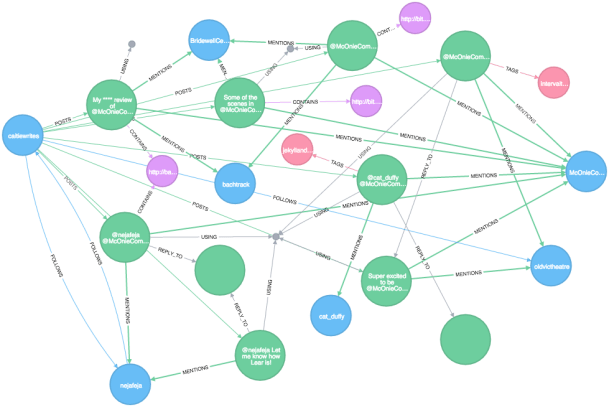
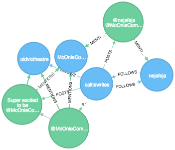
You can also force the nodes to stay where you want. I’ve set this up so that I’m on one side (@caitiewrites), the McOnie Company is on the other (@McOnieCompany) and the things in between are my tweets where the McOnie Company was mentioned, and other people’s interactions with those tweets. Blue dots are people. Green dots are tweets. Purple dots are links. Pink dots are #hashtags. The small grey dots are the platforms used to share things. The labels on the lines tell you what type of relationship each of the dots has with the other nodes it is connected to.
Neo4j can also do fancy pathfinding exercises, like looking only for nodes that have at least 3 degrees of connection (the ‘hops’ between the dots):
MATCH p= ((u:User {screen_name:'caitiewrites'})-[*3]-(m:User {screen_name:'McOnieCompany'})) RETURN p
I’m hoping I can soon overcome being stymied by Python so I can draw more complex dancing graphs. And I’m looking forward to seeing Jekyll & Hyde again next week–I couldn’t resist a second viewing.

Hi Cait, Great piece- though I didn’t understand most of it. How are you? We are preparing for Memorial Day weekend Guests and small dinner party. Love to you MJ
Sent from my iPad